- AMP:Building Accelerated Mobile Pages
- Ruadhan O'Donoghue
- 234字
- 2021-07-08 10:04:07
Using flex and media queries for horizontal layout
To achieve the first goal, we can apply the following properties to the list container:
.related-items {
  display:flex;
  flex-wrap: wrap;
  list-style: none;
}
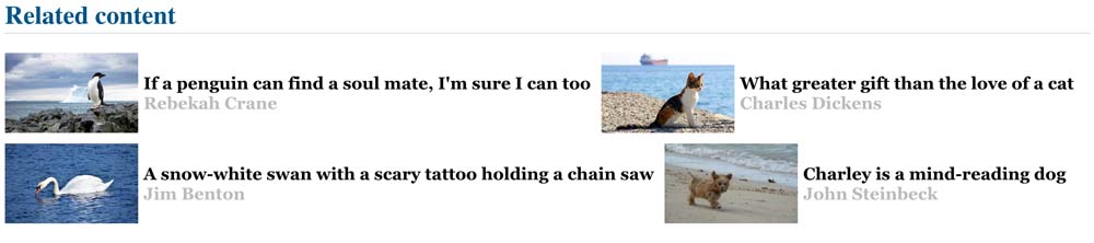
This nearly gets us there. However, it's a little messy: there is no consistency in item width, and depending on the screen width, the list will end up being both horizontal and vertical (as shown in the following image), when we wanted it to be either horizontal or vertical:
We can fix this with a media query. Let's say we have four items. When displayed horizontally, we'll want each to take up 25 percent of the available space. We'll use a width of 50rem as our breakpoint:
@media (min-width:50rem) {
  figure {
    margin:40px;
  }

  .related-thumb {
    flex-basis:25%;
    flex-wrap:wrap;
  }

  .related-thumb amp-img, .related-thumb figcaption{
    flex-basis:100%
  }

  .related-items li {
    width:25%;
  }
}
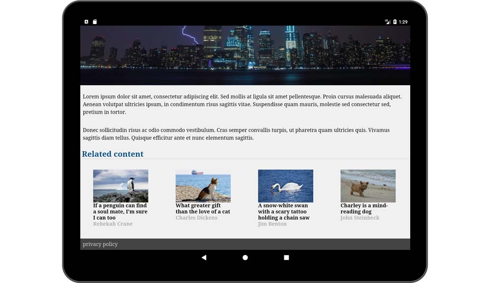
This will give us a 4x1 horizontal list of items on wider screens and a 1x4 vertical list on small screens.
We can push this even further. On mid-sized screens, let's go for a 2x2 grid. To achieve this, we'll add another media query that matches screens between our default and our large screen media queries (full code at /ch3/related-flex-media.html):
    @media (min-width:35rem) and (max-width:50rem) {
       ...
       .related-items li {
        width:50%;
      }
}- Maven Build Customization
- Python應用輕松入門
- 名師講壇:Spring實戰開發(Redis+SpringDataJPA+SpringMVC+SpringSecurity)
- Hands-On Full Stack Development with Go
- UVM實戰
- Learning Probabilistic Graphical Models in R
- 第一行代碼 C語言(視頻講解版)
- Kivy Cookbook
- Unity 3D腳本編程:使用C#語言開發跨平臺游戲
- Spring技術內幕:深入解析Spring架構與設計原理(第2版)
- RESTful Web Clients:基于超媒體的可復用客戶端
- Anaconda數據科學實戰
- Python編程基礎教程
- 體驗之道:從需求到實踐的用戶體驗實戰
- Clojure for Finance