- AMP:Building Accelerated Mobile Pages
- Ruadhan O'Donoghue
- 140字
- 2021-07-08 10:04:07
Using responsive images and srcset to deliver high quality images on all screen sizes
To achieve the second goal, we can use layout="responsive" again, so that the thumbnails will scale for larger screens. The HTML for each item in the list now looks like this:
<li>
  <figure class="related-thumb">
    <amp-img src="img/penguin.jpg" width="125" height="75" layout="responsive"></amp-img>
    <figcaption>
      If a penguin can find a soul mate, I'm sure I can too
      <span class="author">Rebekah Crane</span>
    </figcaption>
  </figure>
</li>
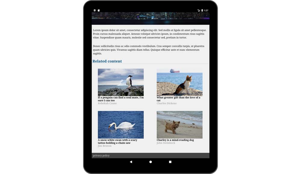
Thumbnails in 2x2 grid and with layout="responsive" scaling up on a larger screen (tablet device in portrait orientation)
There is a problem with this solution, however. It's the same problem that we had earlier when our main feature image was scaled up on large screens: it became pixelated. The same thing will happen with our thumbnails. Thankfully, we can apply the same solution as before using srcset:
<amp-img src="penguin.jpg"
         srcset="img/penguin-sm.jpg 125w,
                 img/penguin.jpg 640w"
         width="125"
         height="75"
         layout="responsive"
</amp-img>
Now, on larger screens, the browser will automatically use the higher resolution image.
推薦閱讀
- C語言程序設計教程
- Deploying Node.js
- Android應用程序開發與典型案例
- 從程序員到架構師:大數據量、緩存、高并發、微服務、多團隊協同等核心場景實戰
- Functional Programming in JavaScript
- Unity Shader入門精要
- ArcGIS By Example
- 軟件測試技術指南
- Learning OpenStack Networking(Neutron)
- “笨辦法”學C語言
- Spring Security Essentials
- After Effects CC案例設計與經典插件(視頻教學版)
- Implementing Microsoft Dynamics NAV(Third Edition)
- JavaScript Unit Testing
- VMware vSphere Design Essentials