- Building UIs with Wijmo
- Yuguang Zhang
- 1347字
- 2021-08-06 17:01:50
Wijmo additions to the dialog widget at a glance
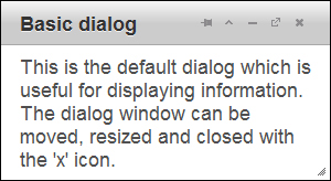
By default, the dialog window includes the pin, toggle, minimize, maximize, and close buttons. Pinning the dialog to a location on the screen disables the dragging feature on the title bar. The dialog can still be resized. Maximizing the dialog makes it take up the area inside the browser window. Toggling it expands or collapses it so that the dialog contents are shown or hidden with the title bar remaining visible. If these buttons cramp your style, they can be turned off with the captionButtons option. You can see how the dialog is presented in the browser from the following screenshot:
Wijmo features additional API compared to jQuery UI for changing the behavior of the dialog. The new API is mostly for the buttons in the title bar and managing window stacking. Window stacking determines which windows are drawn on top of other ones. Clicking on a dialog raises it above other dialogs and changes their window stacking settings. The following table shows the options added in Wijmo.
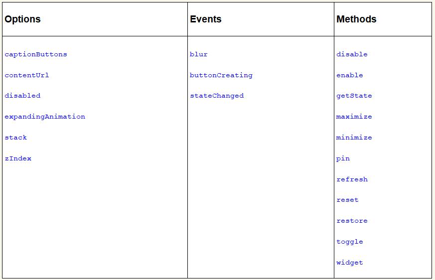
- The
contentUrloption allows you to specify a URL to load within the window. - The
expandingAnimationoption is applied when the dialog is toggled from a collapsed state to an expanded state. - The
stackandzIndexoptions determine whether the dialog sits on top of other dialogs. - Similar to the
blurevent on input elements, theblurevent for dialog is fired when the dialog loses focus. - The
buttonCreatingmethod is called when buttons are created and can modify the buttons on the title bar. - The
disablemethod disables the event handlers for the dialog. It prevents the default button actions and disables dragging and resizing. - The
widgetmethod returns the dialog HTML element. - The methods
maximize,minimize,pin,refresh,reset,restore, andtoggle, are available as buttons on the title bar. The best way to see what they do is play around with them. - In addition, the
getStatemethod is used to find the dialog state and returns either maximized, minimized, or normal. - Similarly, the
stateChangedevent is fired when the state of the dialog changes.
The methods are called as a parameter to the wijdialog method. To disable button interactions, pass the string disable:
$("#dialog").wijdialog ("disable");
Many of the methods come as pairs, and enable and disable are one of them. Calling enable enables the buttons again. Another pair is restore/minimize. minimize hides the dialog in a tray on the left bottom of the screen. restore sets the dialog back to its normal size and displays it again.
The most important option for usability is the captionButtons option. Although users are likely familiar with the minimize, resize, and close buttons; the pin and toggle buttons are not featured in common desktop environments. Therefore, you will want to choose the buttons that are visible depending on your use of the dialog box in your project. To turn off a button on the title bar, set the visible option to false. A default jQuery UI dialog window with only the close button can be created with:
$("#dialog").wijdialog({captionButtons: {
  pin: { visible: false },
  refresh: { visible: false },
  toggle: { visible: false },
  minimize: { visible: false },
  maximize: { visible: false }
  }
});
The other options for each button are click, iconClassOff, and iconClassOn. The click option specifies an event handler for the button. Nevertheless, the buttons come with default actions and you will want to use different icons for custom actions. That's where iconClass comes in. iconClassOn defines the CSS class for the button when it is loaded. iconClassOff is the class for the button icon after clicking. For a list of available jQuery UI icons and their classes, see http://jquery-ui.googlecode.com/svn/tags/1.6rc5/tests/static/icons.html.
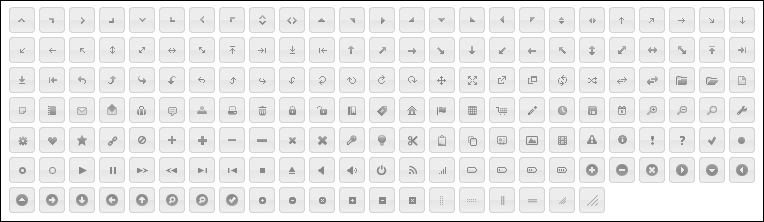
Our next example uses ui-icon-zoomin, ui-icon-zoomout, and ui-icon-lightbulb. They can be found by toggling the text for the icons on the web page as shown in the preceding screenshot.
Adding custom buttons
jQuery UI's dialog API lacks an option for configuring the buttons shown on the title bar. Wijmo not only comes with useful default buttons, but also lets you override them easily.
<!DOCTYPE HTML>
<html>
<head>
  ...
  <style>
    .plus {
      font-size: 150%;
    }
  </style>
  <script id="scriptInit" type="text/javascript">
    $(document).ready(function () {
      $('#dialog').wijdialog({
        autoOpen: true,
        captionButtons: {
        pin: { visible: false },
        refresh: { visible: false },
        toggle: {visible: true, click: function () {
          $('#dialog').toggleClass('plus')
        }, iconClassOn: 'ui-icon-zoomin', iconClassOff:   'ui-icon-zoomout'},
        minimize: { visible: false },
        maximize: {visible: true, click: function () {
        alert('To enloarge text, click the zoom icon.')
        }, iconClassOn: 'ui-icon-lightbulb'},
        close: {visible: true, click: self.close, iconClassOn:'ui-icon-close'}
        }
      });
    });
  </script>
</head>
<body>
  <div id="dialog" title="Basic dialog">
    <p>Loremipsum dolor sitamet, consectetueradipiscingelit. Aeneancommodo ligula eget dolor.Aeneanmassa. Cum sociisnatoquepenatibusetmagnis dis parturient montes, nasceturridiculus mus. Donec quam felis, ultriciesnec, pellentesqueeu, pretiumquis, sem. Nullaconsequatmassaquisenim. Donecpedejusto, fringillavel, aliquetnec, vulputate</p>
  </div>
</body>
</html>
We create a dialog window passing in the captionButtons option. The pin, refresh, and minimize buttons have visible set to false so that the title bar is initialized without them. The final output looks as shown in the following screenshot:
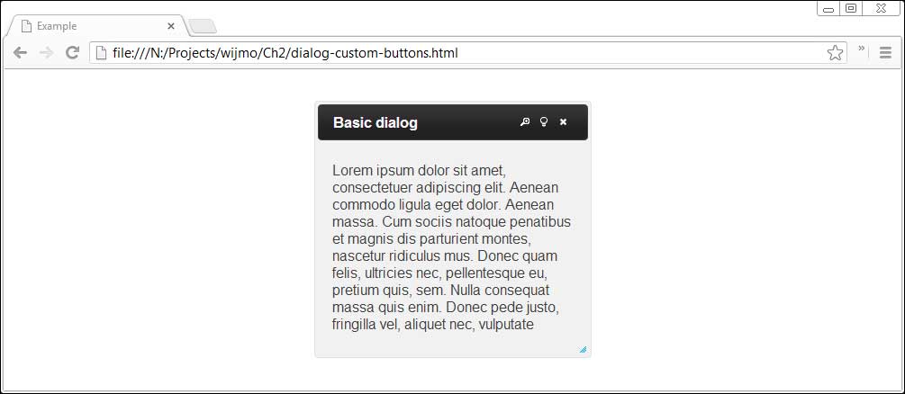
In addition, the toggle and maximize buttons are modified and given custom behaviors. The toggle button toggles the font size of the text by applying or removing a CSS class. Its default icon, set with iconClassOn, indicates that clicking on it will zoom in on the text. Once clicked, the icon changes to a zoom out icon. Likewise, the behavior and appearance of the maximize button have been changed. In the position where the maximize icon was displayed in the title bar previously, there is now a lightbulb icon with a tip.
Although this method of adding new buttons to the title bar seems clumsy, it is the only option that Wijmo currently offers. Adding buttons in the content area is much simpler. The buttons option specifies the buttons to be displayed in the dialog window content area below the title bar. For example, to display a simple confirmation button:
$('#dialog').wijdialog({buttons: {ok: function () {
  $(this).wijdialog('close')
}}});
The text displayed on the button is ok and clicking on the button hides the dialog. Calling $('#dialog').wijdialog('open') will show the dialog again.
Configuring the dialog widget's appearance
Wijmo offers several options that change the dialog's appearance including title, height, width, and position. The title of the dialog can be changed either by setting the title attribute of the div element of the dialog, or by using the title option. To change the dialog's theme, you can use CSS styling on the wijmo-wijdialog and wijmo-wijdialog-captionbutton classes:
<!DOCTYPE HTML>
<html>
<head>
...
<style>
.wijmo-wijdialog {
/*rounded corners*/
-webkit-border-radius: 12px;
border-radius: 12px;
background-clip: padding-box;
/*shadow behind dialog window*/
-moz-box-shadow: 3px 3px 5px 6px #ccc;
-webkit-box-shadow: 3px 3px 5px 6px #ccc;
box-shadow: 3px 3px 5px 6px #ccc;
/*fade contents from dark gray to gray*/
background-image: -webkit-gradient(linear, left top, left bottom, from(#444444), to(#999999));
background-image: -webkit-linear-gradient(top, #444444, #999999);
background-image: -moz-linear-gradient(top, #444444, #999999);
background-image: -o-linear-gradient(top, #444444, #999999);
background-image: linear-gradient(to bottom, #444444, #999999);
background-color: transparent;
text-shadow: 1px 1px 3px #888;
}
</style>
<script id="scriptInit" type="text/javascript">
$(document).ready(function () {
$('#dialog').wijdialog({width: 350});
});
</script>
</head>
<body>
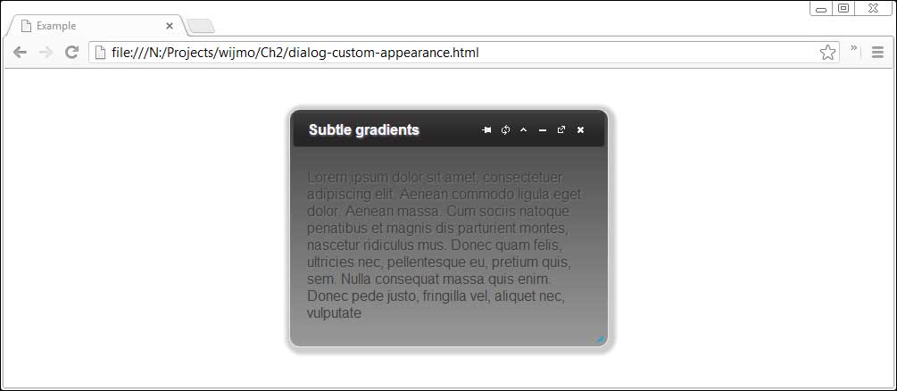
<div id="dialog" title="Subtle gradients">
<p>Loremipsum dolor sitamet, consectetueradipiscingelit. Aeneancommodo ligula eget dolor.Aeneanmassa. Cum sociisnatoquepenatibusetmagnis dis parturient montes, nasceturridiculus mus. Donec quam felis, ultriciesnec, pellentesqueeu, pretiumquis, sem. Nullaconsequatmassaquisenim. Donecpedejusto, fringillavel, aliquetnec, vulputate
</p>
</div>
</body>
</html>
We now add rounded boxes, a box shadow, and a text shadow to the dialog box. This is done with the .wijmo-wijdialog class. Since many of the CSS3 properties have different names on different browsers, the browser specific properties are used. For example, -webkit-box-shadow is necessary on Webkit-based browsers. The dialog width is set to 350 px when initialized so that the title text and buttons all fit on one line.
Loading external content
Wijmo makes it easy to load content in an iFrame. Simply pass a URL with the contentUrl option:
$(document).ready(function () {
  $("#dialog").wijdialog({captionButtons: {
    pin: { visible: false },
    refresh: { visible: true },
    toggle: { visible: false },
    minimize: { visible: false },
    maximize: { visible: true },
    close: { visible: false }
    },
  contentUrl: "http://wijmo.com/demo/themes/"
  });
});
This will load the Wijmo theme explorer in a dialog window with refresh and maximize/restore buttons. This output can be seen in the following screenshot:
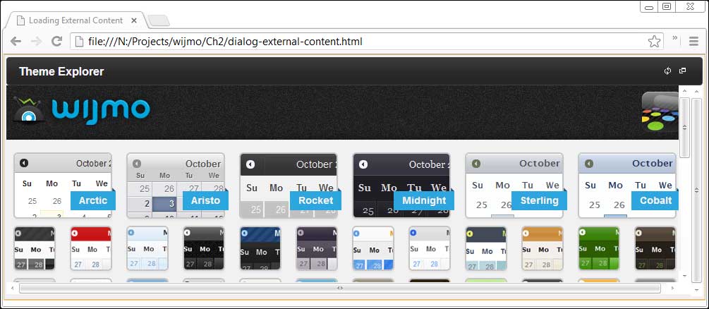
The refresh button reloads the content in the iFrame, which is useful for dynamic content. The maximize button resizes the dialog window.
- Visual Basic程序設計習題解答與上機指導
- MATLAB實用教程
- Web程序設計(第二版)
- Mastering Google App Engine
- Gradle for Android
- Oracle從入門到精通(第5版)
- C語言程序設計教程
- Oracle 18c 必須掌握的新特性:管理與實戰
- Python語言實用教程
- Statistical Application Development with R and Python(Second Edition)
- Quantum Computing and Blockchain in Business
- Visual Basic程序設計習題與上機實踐
- Python Programming for Arduino
- TypeScript圖形渲染實戰:2D架構設計與實現
- 人人都能開發RPA機器人:UiPath從入門到實戰