- matplotlib Plotting Cookbook
- Alexandre Devert
- 220字
- 2021-07-16 12:16:26
Plotting histograms
Histograms are graphical representations of a probability distribution. In fact, a histogram is just a specific kind of a bar chart. We could easily use matplotlib's bar chart function and do some statistics to generate histograms. However, histograms are so useful that matplotlib provides a function just for them. In this recipe, we are going to see how to use this histogram function.
How to do it...
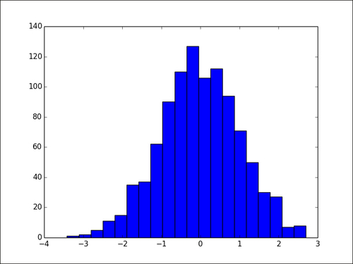
The following script draws 1000 values from a normal distribution and then generates histograms with 20 bins:
import numpy as np
import matplotlib.pyplot as plt

X = np.random.randn(1000)

plt.hist(X, bins = 20)
plt.show()
The histogram will change a bit each time we run the script as the dataset is randomly generated. The preceding script will display the following graph:
How it works...
The pyplot.hist() function takes a list of values as the input. The range of the values will be divided into equal-sized bins (10 bins by default). The pyplot.hist() function will generate a bar chart, one bar for one bin. The height of one bar is the number of values following in the corresponding bin. The number of bins is determined by the optional parameter bins. By setting the optional parameter normed to True, the bar height is normalized and the sum of all bar heights is equal to 1.
- jQuery EasyUI網站開發實戰
- Learn Swift by Building Applications
- Learning Firefox OS Application Development
- HTML5+CSS3網站設計基礎教程
- ASP.NET 3.5程序設計與項目實踐
- 小學生C++創意編程(視頻教學版)
- Scala Reactive Programming
- Python深度學習原理、算法與案例
- Developing SSRS Reports for Dynamics AX
- Python Web自動化測試設計與實現
- SEO教程:搜索引擎優化入門與進階(第3版)
- SAS編程演義
- 軟硬件綜合系統軟件需求建模及可靠性綜合試驗、分析、評價技術
- 計算機系統解密:從理解計算機到編寫高效代碼
- C/C++代碼調試的藝術