- Simulation for Data Science with R
- Matthias Templ
- 1983字
- 2021-07-14 11:17:07
Visualizing information
In many chapters, results are visualized using the graphics capabilities of R. Thus, we will give a very short introduction to the base graphics package, plus a short introduction to the package ggplot2 (Wickham, 2009).
The reader will learn briefly about the graphical system in R, different output formats for traditional graphics system, customization and fine tuning of standard graphics, and the ggplot2 package.
Tip
Other packages such as ggmap, ggvis, lattice, or grid are not touched on here. Interactive graphics are also beyond the scope of this book (Google Charts, rgl, iplots, JavaScript, and R).
The graphics system in R
Many packages include methods to produce plots. Generally, they either use the functionality of the base R package called graphics or the functionality of the package grid.
For example, the package maptools (Bivand and Lewin-Koh, 2015) includes methods for mapping; with this package one can produce maps. It uses the capabilities of the graphics package. Package ggplot2 is based on the grid package and uses the functionality of the grid package for constructing advanced graphics.
Both packages, graphics and grid, include basic plot methods, and both packages use the graphical system of the operating system for plotting, which is hidden from the user. These graphical features from the operating system are attached by the graphical devices (?grDevices) of R, which also include support for colors and fonts.
The graphical output is either on screen or saved as a file. The screen devices pop-up as soon as a function such as plot()* is called. Typical screen devices are X11()** (X Windows window), windows() (Microsoft Windows window), and quartz (OS X). File devices include postscript() (PostScript format), pdf() (PDF format), jpeg() (JPEG), bmp (bitmap format), svg() (scalable vector graphics), and cairo() — the cairo-based graphics device that comes with its own graphic library to generate PDF, PostScript, SVG, or bitmap output (PNG, JPEG, TIFF), and X11.
In practice, there is almost no difference between plotting on the screen or in a PDF. Note that the current state of a device can be stored and copied to other devices.
The most common graphic devices are X11(), pdf(), postscript(), png(), and jpg().
For example, to save in pdf:
pdf(file = "myplot.pdf")
plot(Horsepower ~ Weight, data = Cars93)
dev.off ()
The available graphics devices are machine dependent. You can check the available ones using ?Devices.
Note that various function arguments such as width, height, and quality, ..., can be used to modify the output.
The main question is which output format should be used?
The answer is rather simple: X11 for displaying the image (automatically with, for example, RStudio); and pdf (or PostScript) for line graphics. These graphics are scalable without losing quality. png (or jpg) should be used for pixel graphics or graphics with many data points. Pixel graphics are not scalable without losing quality. svg has advantages in the browser (scalable, responsive — important in web design), but it does not include all fonts.
The graphics package
The package graphics is the traditional graphics system. Even though there are other packages for visualization available that produce publication quality plots perfectly, the graphics package is mainly used for producing figures quickly in order to explore content on-the-fly. Within this package, different types of function exist:
- High-level graphics functions: Opens a device and create a plot (for example,
plot()) - Low-level graphics functions: Add output to existing graphics (for example,
points()) - Interactive functions: Allow interaction with graphical output (for example,
identify())
Typically, a combination of multiple graphics functions is used to create a plot.
Each graphics device can be seen as a (abstract) sheet of paper. Thus with the graphics package we can draw using many pens in many colors, but no eraser is available. Multiple devices can be simultaneously opened and one can draw in one (the "active") graphics device.
Warm-up example – a high-level plot
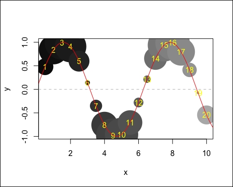
We want to plot filled circles where the size depends on the absolute value of y and the color depends on the value of x:
x <- 1:20 / 2 # x ... 0.5, 1.0, 1.5, ..., 10.0
y <- sin(x)
plot(x, y, pch = 16, cex = 10 * abs(y), col = grey(x / 14))
We have already learned that plot() is a high-level plot function, and that we can add something to an existing plot with a low-level plot function. Let's add some text, a curve and a line, as seen in the following figure:
plot(x, y, pch = 16, cex = 10 * abs(y), col = grey(x / 14))
text(x, y, 1:20, col="yellow")
curve(sin, -2 * pi, 4 * pi, add = TRUE, col = "red")
abline(h = 0, lty = 2, col = "grey")
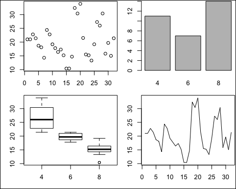
The function plot() is a generic function. It is overloaded with methods, and R selects the method depending on the class of the object to be plotted (method dispatch of R). It also shows different outputs depending on the class of the object to be plotted.
This can be seen in the following, where a numeric vector is first plotted, and then a factor, and then a data frame with one variable as a factor, and finally an object of class ts, as shown in the following figure:
par(mfrow=c(2,2))
mpg <- mtcars$mpg
cyl <- factor(mtcars$cyl)
df <- data.frame(x1=cyl, x2=mpg)
tmpg <- ts(mpg)
plot(mpg); plot(cyl); plot(df); plot(tmpg)
To know which plot methods are currently available, one can type methods(plot) into R:
tail(methods(plot)) ## last 6
## [1] "plot.TukeyHSD" "plot.tune" "plot.varclus" "plot.Variogram"
## [5] "plot.xyVector" "plot.zoo"
## number of methods for plot
length(methods(plot))
## [1] 145
Subsequent calls produce (almost) equivalent results. Note that the last call uses the formula interface of R, see ?formula:
plot(x=mtcars$mpg, y=mtcars$hp)
plot(mtcars$mpg, mtcars$hp)
plot(hp ~ mpg, data=mtcars)
Control of graphics parameters
Customizing graphics and changing the default output is almost always necessary, because: high-level plot functions do not always produce the desired final result, functionality for the fine tuning of graphics is necessary (colors, icons, fonts, line widths, etc); you need information about the plot regions and coordinate system to place the output of low-level functions, multiple graphs on a page.
Graphical parameters are the key to changing the appearance of graphics, including, for example, colors, fonts, linetypes, and axis definitions.
Each open device has its own independent list of graphics parameters and most parameters can be directly specified in high- or low-level plotting functions.
Important: all graphic parameters can be set via function par, see ?par. The most important function arguments of par are: mfrow for multiple graphics, col for colors, lwd for line widths, cex for the size of symbols, pch for selecting symbols, and lty for different kinds of lines.
In the following examples we will only discuss the control of colors.
Here are some possibilities: in R you can default address colors by name via colors(). rgb() to mix red-green-blue. Using hsv() is even better as it offers a pre-defined set of pallets with rainbow colors and many others, for example, ?rainbow, predefined set of palettes with palette().
Predefined palettes using the RColorBrewer package (Neuwirth, 2014).
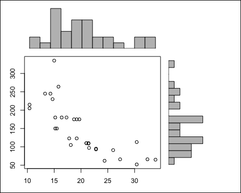
Multiple plots with package graphics can be done via par(mfrow = c (2,2)). However, a more flexible is to use the function layout, see ?layout for examples.
We will show one example for layout by constructing a plot that doesn't exist in R. Note that a slightly modified version of this example was used in the lectures of Friedrich Leisch.
We will first calculate some numbers that are used afterwards to place the graphics:
## min und max in both axis
xmin <- min(mtcars$mpg); xmax <- max(mtcars$mpg)
ymin <- min(mtcars$hp); ymax <- max(mtcars$hp)

## calculate histograms
xhist <- hist(mtcars$mpg, breaks=15, plot=FALSE)
yhist <- hist(mtcars$hp, breaks=15, plot=FALSE)

## maximum count
top <- max(c(xhist$counts, yhist$counts))
xrange <- c(xmin,xmax)
yrange <- c(ymin, ymax)
We now produce the following figure:
m <- matrix(c(2, 0, 1, 3), 2, 2, byrow = TRUE)
## define plot order and size
layout(m, c(3,1), c(1, 3), TRUE)
## first plot
par(mar=c(0,0,1,1))
plot(mtcars[,c("mpg","hp")], xlim=xrange, ylim=yrange, xlab="", ylab="")
## second plot -- barchart of margin
par(mar=c(0,0,1,1))
barplot(xhist$counts, axes=FALSE, ylim=c(0, top), space=0)
## third plot -- barchart of other margin
par(mar=c(3,0,1,1
))
barplot(yhist$counts, axes=FALSE, xlim=c(0, top), space=0, horiz=TRUE)
The ggplot2 package
Why use ggplot2?
- Gives a consistent and systematic approach to generating graphics
- Based on the book Grammar of Graphics by Wilkinson (1999)
- Very flexible
- Customizable, allows you to define your own themes (for example, for cooperative designs in companies)
- But slow and not as easy to learn
In ggplot2, the parts of a plot are defined independently. The anatomy of a plot consists of: data, must be a data frame (object of class data.frame); and aesthetic mapping, which describes how variables in the data are mapped to visual properties (aesthetics) of geometric objects. This must be done within the function aes(). assignment, where values are mapped to visual properties. It must also be done outside the function aes(). geometric objects (geom's, aesthetic will be mapped to geometric objects), for example, geom_point() - statistical transformations, for example, function stat_boxplot(), scales, coordinate system, position adjustments, and faceting, for example, function facet_wrap.
Aesthetic means "something you can see", for example, colors, fill (color), shape (of points), linetypes, size, and so on. Aesthetic mapping to geometric objects is done using function aes().
To make a scatterplot with Horsepower and MPG.city for the Cars93 data set, you use the following command:
library("ggplot2")
ggplot(Cars93, aes(x = Horsepower, y = MPG.city)) + geom_point(aes(colour = Cylinders))
This command generates the following output:
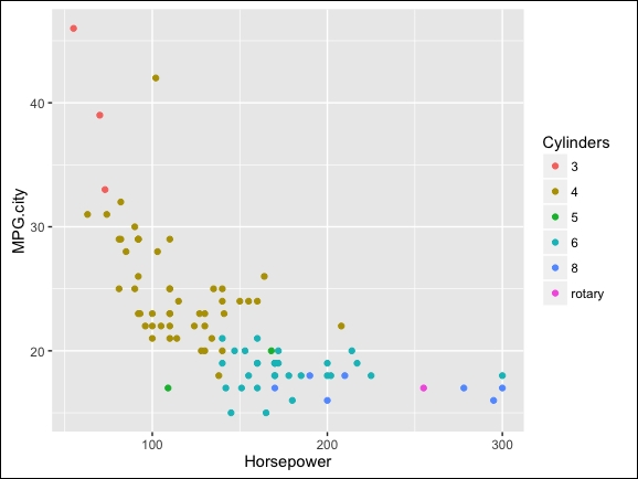
Here, we mapped Horsepower to the x variable, MPG.city to the y variable, Cylinders to color (within aes()!). We used geom_point to tell ggplot2 to produce a scatterplot. Note that a statistical transformation is always defined, mostly this, as in our example, is the identity (leave the points as they are).
Note that each type of geom accepts only a subset of aesthetics (for example, setting shape in aes() and makes no sense when mapped to geom_bar) We add a geom by using +.
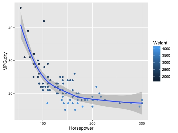
We can simple use more than one geom, here we also add a scatterplot smoothing, and we perform an aesthetic mapping of weights to color (within aes()). Automatically, a legend is produced, as seen in the following screenshot:
g1 <- ggplot(Cars93, aes(x=Horsepower, y=MPG.city))
g2 <- g1 + geom_point(aes(color=Weight))
g2 + geom_smooth()
## geom_smooth: method="auto" and size of largest group is <1000, so using loess. Use 'method = x' to change the smoothing method.
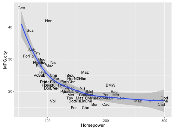
We still have g1 available in our workspace, so we can add something else, for example, text, resulting in following screenshot:
g1 <- g1 + geom_text(aes(label=substr(Manufacturer,1,3)), size=3.5)
g1 + geom_smooth()
## geom_smooth: method="auto" and size of largest group is <1000, so using loess. Use 'method = x' to change the smoothing method.
Each block of a ggplot2 is defined by a list of parameters. To make life easy, sensible standard default parameter values are set.
All (geoms) are associated with statistical transformations. For some geoms, the data is modified, for example, geom_boxplot. Note that geom_boxplot must not be called whenever the statistical transformation stat_boxplot is called — automatically ggplot2 knows that it should use geom_boxplot.
With scales, aesthetics for variables can be defined, such as color and fill (color), size, shape, linetype, and so on, by using the function **scale__**.
A "standardized" graphic for each group in the data can be done — for one grouping variable use facet_wrap(), for two grouping variables use facet_grid().
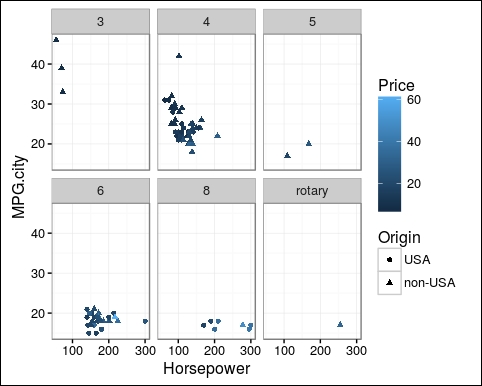
We will show one example of how to set the syntax for facet_wrap, and we use another theme for the following output:
gg <- ggplot(Cars93, aes(x=Horsepower, y=MPG.city))
gg <- gg + geom_point(aes(shape = Origin, colour = Price))
gg <- gg + facet_wrap(~ Cylinders) + theme_bw()
gg
The output is as follows:
Note that themes can be used for cooperative design. Two themes comes with ggplot2: theme_gray() (the default one), and theme_bw().
Take a look at more information on themes by typing ?theme_gray into R references:
- Spring Boot 2實戰之旅
- Learning LibGDX Game Development(Second Edition)
- Google Apps Script for Beginners
- Machine Learning with R Cookbook(Second Edition)
- Mastering Predictive Analytics with Python
- C程序設計案例教程
- Apache Kafka Quick Start Guide
- Scala Reactive Programming
- Java圖像處理:基于OpenCV與JVM
- Python預測之美:數據分析與算法實戰(雙色)
- AutoCAD基礎教程
- Java自然語言處理(原書第2版)
- jQuery Mobile Web Development Essentials(Second Edition)
- Google Adsense優化實戰
- Learning Cocos2d-JS Game Development