- UX Design for Mobile
- Pablo Perea Pau Giner
- 223字
- 2021-07-15 17:29:48
Area naming
There are words that have a completely different meaning for one person to another, especially if those people are thinking in different fields when they use our solution. Understanding our user needs, and how they think and speak, will help us provide clear names for sections and subsections. For example, the word pool will represent a different set of products for a person looking for summer products than for a person looking for games.
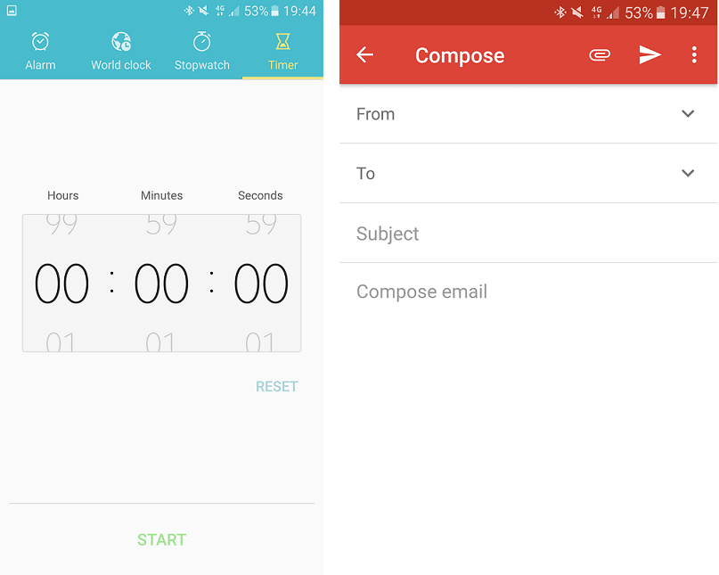
In the case of applications, we will have to find a balance between simplicity and clarity. If space permits, adding a label along with the icon will clarify and reduce the possible ambiguities that may be encountered in recognizing the meaning of these graphic representations. In the case of mobiles, where space is really small, we can find some universal icons, but we must test with users to ensure that they interpret them properly.
In the following examples, you can find two different approaches. In the Gmail app, attach and send are known icons and can work without a label. We find a very different scenario in the Samsung Clock app, where it would be really difficult to differentiate between the Alarm, the Stopwatch, and the Timer without labels: