- AMP:Building Accelerated Mobile Pages
- Ruadhan O'Donoghue
- 91字
- 2021-07-08 10:04:08
Vertical flex items
Flex items can also be arranged vertically in columns. This time, we flip the width and height dimensions of the parent so that it is three times as high as it is wide:
.flex-container-col {
    display: flex;
    flex-direction: col;
    width: 150px;
    height: 450px;
}
...

<div class="flex-container-col">
  <!-- 1 flex item -->
  <amp-img src="img/placeholder.png" layout="flex-item"></amp-img>
</div>

<div class="flex-container-col">
  <!-- 2 flex items -->
  <amp-img src="img/placeholder.png" layout="flex-item"></amp-img>
  <amp-img src="img/placeholder.png" layout="flex-item"></amp-img>
</div>
...

<div class="flex-container-col">
  <!-- 7 flex items -->
  <amp-img src="img/placeholder.png" layout="flex-item"></amp-img>
  <amp-img src="img/placeholder.png" layout="flex-item"></amp-img>
  ...
</div>
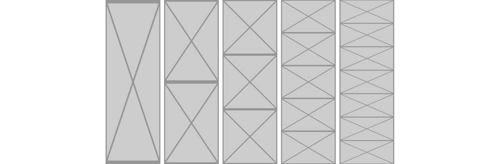
Vertical flex items being distorted depending on how many there are
Again, note how the flex items are distorted in the preceding examples. This is fine for containers, but it might not be what you're after when it comes to images.
推薦閱讀
- 高手是如何做產品設計的(全2冊)
- Kali Linux Web Penetration Testing Cookbook
- 程序員面試白皮書
- 工程軟件開發技術基礎
- 深入實踐Spring Boot
- 算法大爆炸:面試通關步步為營
- C語言程序設計實訓教程
- Cassandra Data Modeling and Analysis
- Learning OpenStack Networking(Neutron)
- 零基礎學Python網絡爬蟲案例實戰全流程詳解(入門與提高篇)
- C#程序設計(項目教學版)
- Building Serverless Web Applications
- C陷阱與缺陷
- C/C++代碼調試的藝術(第2版)
- 城市信息模型平臺頂層設計與實踐