- R Programming By Example
- Omar Trejo Navarro
- 236字
- 2021-07-02 21:30:42
Understanding interactions with correlations
The correlation is a measure of the linear relation among two variables. Its value ranges from -1, representing a perfect inverse relation, to 1, representing a perfect direct relation. Just as we created a matrix of scatter plots, we will now create a matrix of correlations, and resulting graph is shown below. Large circles mean high absolute correlation. Blue circles mean positive correlation, while red circles mean negative correlation.
To create this plot we will use the corrplot() function from the corrplot package, and pass it the correlations data computed by the cor() function in R, and optionally some parameters for the text labels (tl), such as color (color) and size (cex).
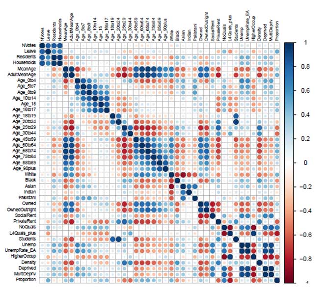
Variable Correlations
Now, let's look at the following code:
library(corrplot)
corrplot(corr = cor(data_numerical), tl.col = "black", tl.cex = 0.6)
If we look at the relation among the Proportion variable and the other variables, variables in large blue circles are positively correlated with it, meaning that the more that variable increases, the more likely it is for the Proportion variable to also increase. For examples of this type, look at the relations among AdultMeanAge and NoQuals with Proportion. If we find large red circles among Proportion and other variables, it means that the more that variable increases, the more Proportion is likely to decrease. For examples of this type, look at the relations among Age_25to29, Age_30to44, and L4Quals_plus with Proportion:
- 大數(shù)據(jù)項(xiàng)目管理:從規(guī)劃到實(shí)現(xiàn)
- 來(lái)吧!帶你玩轉(zhuǎn)Excel VBA
- 空間傳感器網(wǎng)絡(luò)復(fù)雜區(qū)域智能監(jiān)測(cè)技術(shù)
- CorelDRAW X4中文版平面設(shè)計(jì)50例
- 基于多目標(biāo)決策的數(shù)據(jù)挖掘方法評(píng)估與應(yīng)用
- 新手學(xué)電腦快速入門(mén)
- 水晶石影視動(dòng)畫(huà)精粹:After Effects & Nuke 影視后期合成
- 計(jì)算機(jī)組成與操作系統(tǒng)
- ZigBee無(wú)線通信技術(shù)應(yīng)用開(kāi)發(fā)
- Xilinx FPGA高級(jí)設(shè)計(jì)及應(yīng)用
- 手把手教你學(xué)Flash CS3
- PostgreSQL 10 High Performance
- 巧學(xué)活用Photoshop
- 玩轉(zhuǎn)機(jī)器人:基于Proteus的電路原理仿真(移動(dòng)視頻版)
- PVCBOT零基礎(chǔ)機(jī)器人制作(第2版)