- RESS Essentials
- Joanna Krenz-Kurowska Jerzy Kurowski
- 441字
- 2021-07-23 15:38:32
RWD benefits>
Let's take a look at the advantages RWD and RESS can offer to members of each of their various user groups.
Freedom for designers
RWD for designers means the end of the standard-screen-width paradigm that ruled the Web for a long time. When I started web designing, standard screen width was considered to be 600px. Soon it reached 800px and stabilized for years at 1024px (960px standard available width for design).
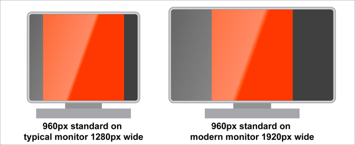
Illustration – standard screen width
Following this "standard", the lowest screen width our visitors used to have, resulted in designs using only 50-75 percent of the screen real estate that most monitors could provide. The rest usually just had some nice background pattern.
Responsive Web Design that had to adjust to various devices' resolutions made the "standard width" concept obsolete. If we do responsive design, why not use all the available space? Standard document 960px width uses less than 40% screen real estate on a monitor more than 2500px wide. Creating documents that use 100% available width allows us to create more engaging and interesting designs. Browsing the best web designs of 2012, one gets the impression that someone opened a box with fullscreen website designs that provide a cinematic or game-like experience (you can see that most of them provide fullscreen experience). This is just the beginning.
Invest less, reach out to a larger audience
This is probably the dream of any website owner. RWD or RESS is not a silver bullet against all problems to provide content to devices. Each case should be carefully analyzed to find out what type of solution is best, or at least possible, in a particular circumstance. Having said that, in many typical applications it is the cheapest and the fastest way to web design. Additional costs of design, implementation, and testing will probably not be even comparable with the cost of creating several mobile website versions together with respective native applications (hybrid applications as described at http://www.wired.com/insights/2012/11/native-apps-vs-mobile-web/).
The Web is a good thing for users, and they definitely prefer a browsable website over one they can hardly see on their smartphone/tablet.
Ability to link content is crucial for the Internet. Users expect links to work no matter how they access the Internet, and it is not possible to link to content inside some native apps. Browsing a mobile version of a website with desktop browsers or the opposite is not comfortable. It may happen though as a natural consequence of the nature of links.
Lowering budget constraint means that more websites can afford to optimize content for more devices, which will hopefully make the Web easier to browse on smartphones.
- 嵌入式Linux開發技術
- Cybersecurity:Attack and Defense Strategies
- Containerization with LXC
- Google系統架構解密:構建安全可靠的系統
- 精解Windows 8
- SOA實踐者說
- 嵌入式應用程序設計綜合教程(微課版)
- 計算機系統開發與優化實戰
- Linux就該這么學
- Microsoft Operations Management Suite Cookbook
- Linux系統安全基礎:二進制代碼安全性分析基礎與實踐
- Raspberry Pi入門指南
- Linux操作系統案例教程(第2版)
- 鴻蒙HarmonyOS應用開發從入門到精通
- Responsive Web Design with AngularJS