- matplotlib Plotting Cookbook
- Alexandre Devert
- 176字
- 2021-07-16 12:16:25
Plotting points
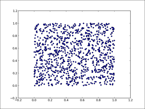
When displaying a curve, we implicitly assume that one point follows another—our data is the time series. Of course, this does not always have to be the case. One point of the data can be independent from the other. A simple way to represent such kind of data is to simply show the points without linking them.
How to do it...
The following script displays 1024 points whose coordinates are drawn randomly from the [0,1] interval:
import numpy as np
import matplotlib.pyplot as plt

data = np.random.rand(1024, 2)

plt.scatter(data[:,0], data[:,1])
plt.show()
The preceding script will produce the following graph:
How it works...
The function plt.scatter() works exactly like plt.plot(), taking the x and y coordinates of points as input parameters. However, each point is simply shown with one marker. Don't be fooled by this simplicity—plt.scatter() is a rich command. By playing with its many optional parameters, we can achieve many different effects. We will cover this in Chapter 2, Customizing the Color and Styles, and Chapter 3, Working with Annotations.
- Learning LibGDX Game Development(Second Edition)
- 數(shù)字媒體應(yīng)用教程
- Python機(jī)器學(xué)習(xí):數(shù)據(jù)分析與評(píng)分卡建模(微課版)
- Visual Basic 6.0程序設(shè)計(jì)計(jì)算機(jī)組裝與維修
- Ext JS Data-driven Application Design
- OpenCV 3和Qt5計(jì)算機(jī)視覺應(yīng)用開發(fā)
- Magento 1.8 Development Cookbook
- Mastering KnockoutJS
- 運(yùn)用后端技術(shù)處理業(yè)務(wù)邏輯(藍(lán)橋杯軟件大賽培訓(xùn)教材-Java方向)
- 微服務(wù)架構(gòu)深度解析:原理、實(shí)踐與進(jìn)階
- Scala Reactive Programming
- Developing SSRS Reports for Dynamics AX
- C語言程序設(shè)計(jì)與應(yīng)用實(shí)驗(yàn)指導(dǎo)書(第2版)
- Mastering OpenStack
- Elastix Unified Communications Server Cookbook