- Expert Data Visualization
- Jos Dirksen
- 116字
- 2021-07-09 18:22:48
Adding the income line
We'll quickly skim over this code, since it's pretty much the same as we used to add the indexed line:
function addIncomeLine(xScale, yIncomeScale, unadjustedCleaned) {
    var lineIncome = d3.line()
        .x(function(d) { return xScale(d.date); })
        .y(function(d) { return yIncomeScale(d.value); })
        .curve(d3.curveCatmullRom.alpha(0.5));

    chart.append("path")
        .attr("d", lineIncome(unadjustedCleaned))
        .style("fill", "none")
        .style("stroke", "steelblue")
        .style("stroke-width", "2");
}
The main change here is that we don't use a gradient for the stroke but use a fixed color. The chart at this point looks like this:
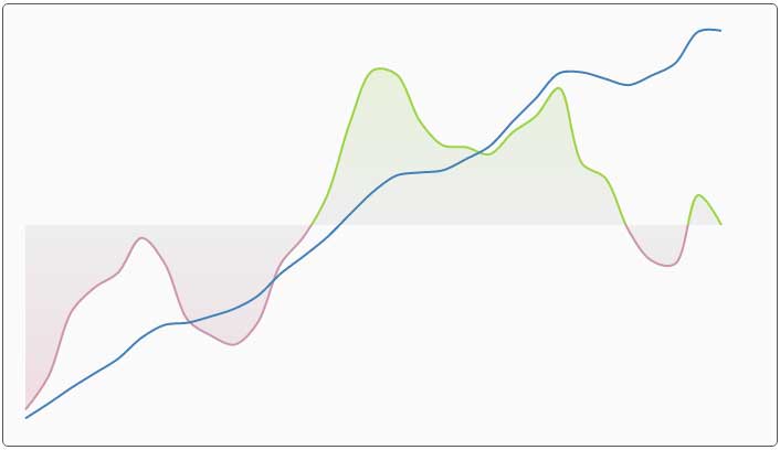
At this point we have visualized the data, but the chart doesn't really look nice yet, and we don't know what the different lines really mean. We'll add this information using a couple of axes.