- Bootstrap 4:Responsive Web Design
- Silvio Moreto Matt Lambert Benjamin Jakobus Jason Marah
- 215字
- 2021-07-09 18:54:42
Making it greater
Maybe you have asked yourself (or even searched for) the reason for the mobile-first paradigm trend. It is simple and makes complete sense for speeding up your development.
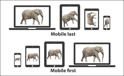
The main argument for the mobile-first paradigm is that it is easier to make it than to shrink it. In other words, if you make a desktop version of the web page (known as responsive design or mobile last) first and then adjust the website for mobile, it has a 99 percent probability of breaking the layout at some point and you will have to fix a lot of things.
On the other hand, if you create the mobile version first, naturally the website will use (or show) less content than the desktop version. So, it will be easier to just add the content, place the things in the right places, and create the fully responsiveness stack.
The following figure tries to illustrate this concept. Going mobile last, you will get a degraded, sharped, and crappy layout and you will get a progressively enhanced, future-friendly, awesome web page if you go mobile first. The following figure tries to illustrate the design flow of each paradigm. You can see what happens to the poor elephant… Mobile-first naturally grows the elephant instead of adjusting it:
- Implementing Modern DevOps
- 無代碼編程:用云表搭建企業數字化管理平臺
- 樂學Web編程:網站制作不神秘
- JavaScript 網頁編程從入門到精通 (清華社"視頻大講堂"大系·網絡開發視頻大講堂)
- Learning Apache Kafka(Second Edition)
- Python數據可視化之Matplotlib與Pyecharts實戰
- Mathematica Data Analysis
- Learning Probabilistic Graphical Models in R
- Mastering Git
- 微信小程序開發與實戰(微課版)
- Beginning C++ Game Programming
- Arduino計算機視覺編程
- OpenMP核心技術指南
- Practical Predictive Analytics
- Elastix Unified Communications Server Cookbook