- Hands-On Mobile Development with .NET Core
- Can Bilgin
- 477字
- 2021-06-24 13:55:40
Using styles
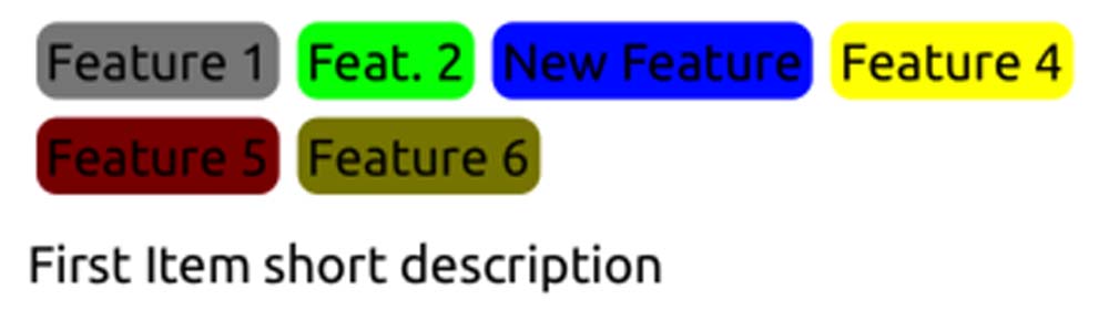
Previously, we created a simple chips container to display the various features of an item that is currently being offered through our application.
In the previous setup, we were only utilizing the Margin property and VerticalTextAlignment for the labels:
<FlexLayout Direction="Row" Wrap="Wrap">
    <Label Text="Feature 1" Margin="4" VerticalTextAlignment="Center" BackgroundColor="Gray" />
    <Label Text="Feat. 2" Margin="4" VerticalTextAlignment="Center" BackgroundColor="Lime"/>
    <!-- Additional Labels -->
</FlexLayout>
Let's modify the look of these items to make the labels look more like chips in order to improve the user experience:
- We will start by wrapping up the label in a frame and styling the frame:
 <Frame
 IsVisible="{Binding HasFeature1}"
 BackgroundColor="Gray"
 CornerRadius="7"
 Padding="3"
 Margin="4"
 HasShadow="false">
  <Label x:Name="Feat1" Text="Feature 1"
 VerticalTextAlignment="Center"
 HorizontalTextAlignment="Center" />
 </Frame>
While this creates a more desirable look, adding these properties to each feature would create a completely redundant XAML structure:
- We can now create create two styles (that is, one for the feature label and one for the frame itself) that will be applied to each element, thereby decreasing the redundancy:
<Style TargetType="Frame">
     <Setter Property="HasShadow" Value="false" />
</Style>
<Style TargetType="Frame" x:Key="ChipContainer">
  <Setter Property="CornerRadius" Value="7" />
  <Setter Property="Padding" Value="3" />
  <Setter Property="Margin" Value="3" />
 </Style>
 <Style TargetType="Label" x:Key="ChipLabel">
  <Setter Property="VerticalTextAlignment" Value="Center" />
  <Setter Property="HorizontalTextAlignment" Value="Center" />
     <Setter Property="TextColor" Value="White" />
 </Style>
- Next, we need to apply these implicit (that is, the HasShadow="false" setter will be applied to all the frames on the application level) and explicit styles (note the x:Key declaration on the ChipContainer and ChipLabel styles):
<FlexLayout Direction="Row" Wrap="Wrap" FlowDirection="LeftToRight" AlignItems="Start">
  <Frame IsVisible="{Binding HasFeature1}"
 BackgroundColor="Gray" Style="{StaticResource
 ChipContainer}">
  <Label x:Name="Feat1" Text="Feature 1" Style="
 {StaticResource ChipLabel}" />
  </Frame>
  <Frame IsVisible="{Binding HasFeature2}" BackgroundColor="Lime"
 Style="{StaticResource ChipContainer}">
  <Label x:Name="Feat2" Text="Feat. 2" Style="{StaticResource
 ChipLabel}" />
  </Frame>
  <!-- Additional Labels -->
 </FlexLayout>
In doing so, we will be decreasing the clutter and redundancy in our XAML tree. Styles can be declared at the application level (as in this case) as global styles using App.xaml. Additionally, they can also be declared at page and view levels using local resource dictionaries.
Another approach to styling controls would be to use CSS style sheets. While the style sheets currently do not support the full extent of the XAML control styles, can prove powerful, especially when utilizing the CSS selectors. Let's get started:
- If we were to recreate the styles for our chip views, the style declarations would be similar to the following:
 .ChipContainerClass {
  border-radius: 7;
  padding: 3;
  margin: 3;
 }

 .ChipLabelClass {
  text-align: center;
  vertical-align: central;
     color: white;
 }
For those of you who are not familiar with CSS, here, we have created two style classes named ChipContainerClass and ChipLabelClass.
- Now, we can use these classes with our controls using the StyleClass attribute:
 <Frame IsVisible="{Binding HasFeature1}"
 BackgroundColor="Gray" StyleClass="ChipContainerClass">
  <Label x:Name="Feat1" Text="Feature 1"
 StyleClass="ChipLabelClass" />
 </Frame>
- We can take our style declaration one step further and apply the style directly to the child label within the frame with the ChipContainerClass style class (that is, we will remove the style class from the Label element):
 .ChipContainerClass {
  border-radius: 7;
  padding: 3;
  margin: 3;
 }

 .ChipContainerClass>^label {
  text-align: center;
  vertical-align: central;
  color: white;
 }
Styles can also be used in conjunction with Xamarin.Forms behaviors to not only modify the visualization, but also the behavior of elements.