- Hands-On Mobile Development with .NET Core
- Can Bilgin
- 240字
- 2021-06-24 13:55:36
Single-page view
In a single-page view, as the name suggests, a single view is used for the content and possible user interaction, and actions are either executed on this view or on action sheets. Depending on the design requirements, this view can be implemented using either ContentPage or TemplatedPage:
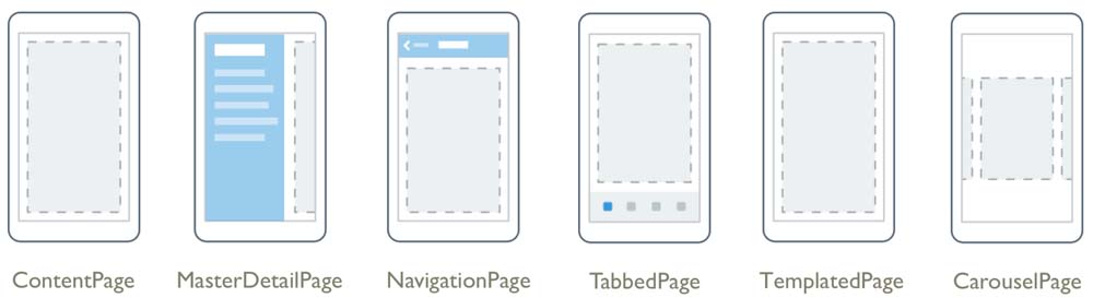
ContentPage is among the most commonly used page definitions. Using this page structure, developers are free to include any layout and view elements within the content definition of a content page.
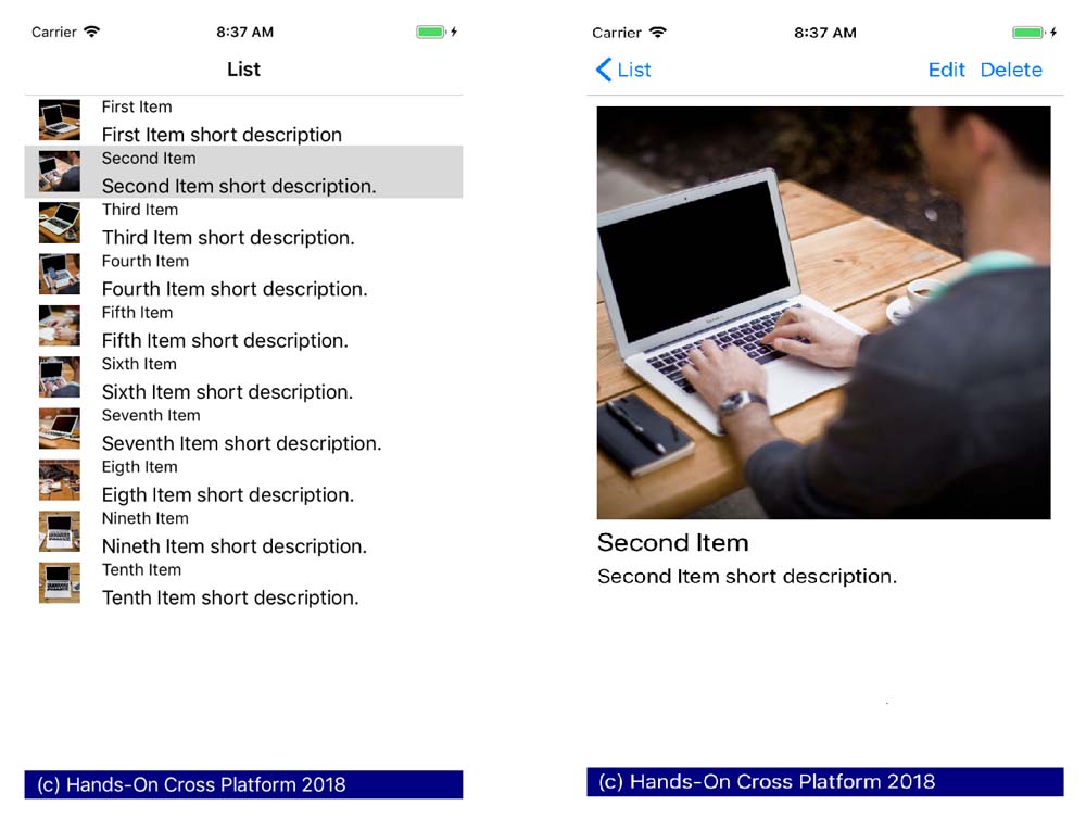
In order to create the item list view that was previously demonstrated, we start by creating our content page:
 <?xml version="1.0" encoding="UTF-8"?>
 <ContentPage
 Title="List"
 xmlns="http://xamarin.com/schemas/2014/forms"
 xmlns:x="http://schemas.microsoft.com/winfx/2009/xaml"
 x:Class="FirstXamarinFormsApplication.Client.ListItemView">
  <ContentPage.ToolbarItems>
         <!-- Removed for brevity -->
  </ContentPage.ToolbarItems>
  <ContentPage.Content>
         <!-- Removed for brevity -->
  </ContentPage.Content>
 </ContentPage>
Here, the content containers that are used are the Content and Toolbar items, to create a list view of items and the toolbar action buttons respectively.
ContentPage is a derivative of TemplatedPage, which is another page type that can be used with Xamarin.Forms applications. TemplatedPage allows developers to create a base style for TemplatePage (that is, ContentPage) so that certain global level customizations can be applied to these pages.
For instance, if we were to expand our previous implementation with a footer, we would need to define a style for this page (in App.xaml):
 <Application.Resources>
  <ResourceDictionary>
  <ControlTemplate x:Key="PageTemplate">
  <Grid>
  <Grid.RowDefinitions>
  <RowDefinition />
  <RowDefinition Height="25" />
  </Grid.RowDefinitions>
  <Grid.ColumnDefinitions>
  <ColumnDefinition />
  </Grid.ColumnDefinitions>
  <ContentPresenter Grid.Row="0" />
  <BoxView Grid.Row="1" Color="Navy" />
  <Label
 Grid.Row="1"
 Margin="10,0,0,0"
 Text="(c) Hands-On Cross Platform 2018"
 TextColor="White"
 VerticalOptions="Center" />
  </Grid>
  </ControlTemplate>
  </ResourceDictionary>
 </Application.Resources>
In this template, notice that ContentPresenter is used as the placeholder for the ContentPage that is to be used. We would apply this template in the ListItemView (and ItemView) pages with the following code:
 <ContentPage
     Title="List"
     ControlTemplate="{StaticResource PageTemplate}"
     xmlns="http://xamarin.com/schemas/2014/forms"
     xmlns:x="http://schemas.microsoft.com/winfx/2009/xaml"
     x:Class="FirstXamarinFormsApplication.Client.ListItemView">
This would result in the footer appearing on both pages: